
Product Categories 12 block design & features
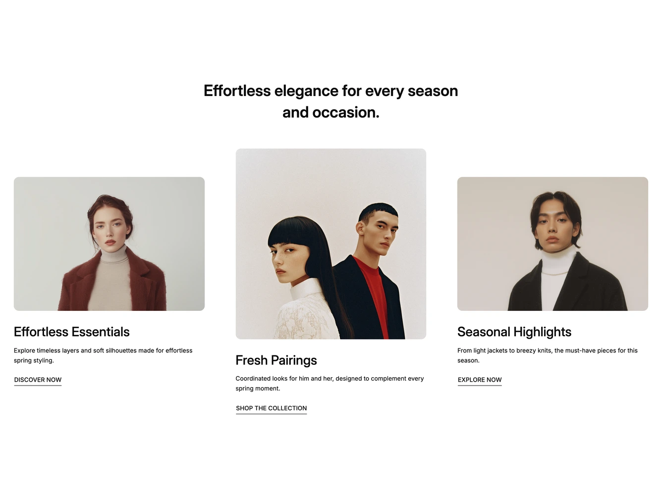
The block introduces three seasonal collections. A short centered heading sits above three cards, where the outer two have landscape photos and the middle one has a taller square photo, giving the row a staggered rhythm. Each card has a title, a line of description and an underlined uppercase call to action. It is built with shadcn/ui.
On large screens hovering a card fades its neighbours back so it stands out, and its link's underline draws closer to the text. The heading and the three collections, each with an image, title, summary and call to action link, are props. The fade is skipped when reduced motion is preferred.
Below the large breakpoint the cards become a carousel, and on mobile it shows about three quarters of one card at a time, with the next card peeking in.