

Product Card 26 block design & features
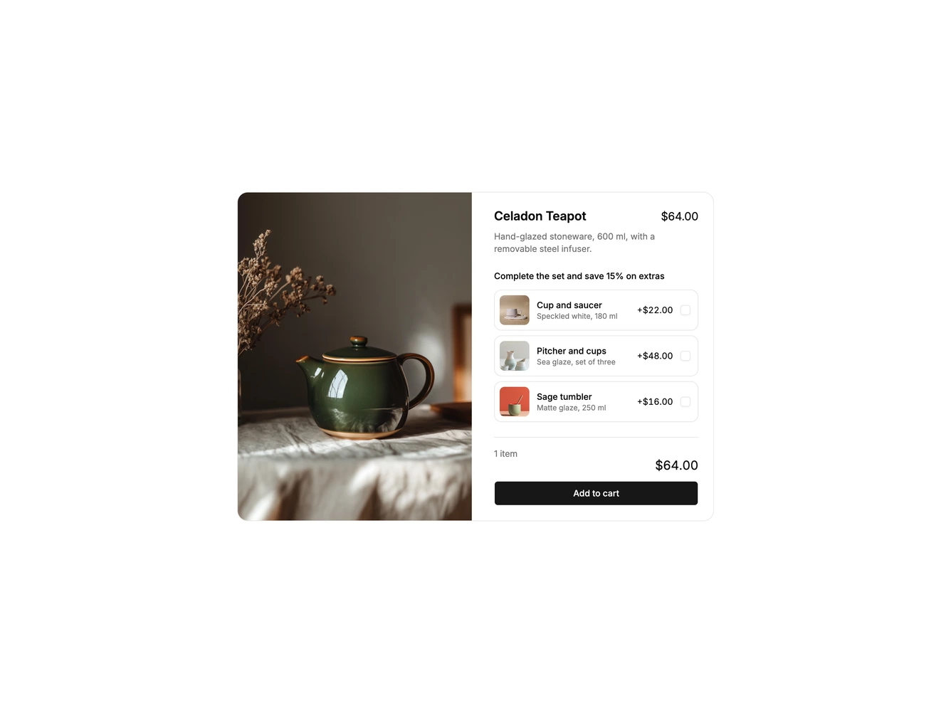
A wide two-column shadcn/ui product card. A tall teapot photo fills the left side; the right side holds the product name, price and description, a list of three add-on rows with thumbnails and prices, and a footer with the item count, the bundle total and an Add to cart button.
Ticking an add-on highlights its row and adds it to the bundle. Extras bought with the teapot are discounted by a set percentage, so the footer shows the bundle price next to the struck-through full price, a You save line fades in, and the button changes to say how many items will be added.
The add-ons use the shadcn Checkbox inside full-row labels inside a fieldset with a legend, and the total is announced politely. The discount rate, add-ons and default selection are all props, and the layout stacks into a single column on small screens.