
Product Card 18 block design & features
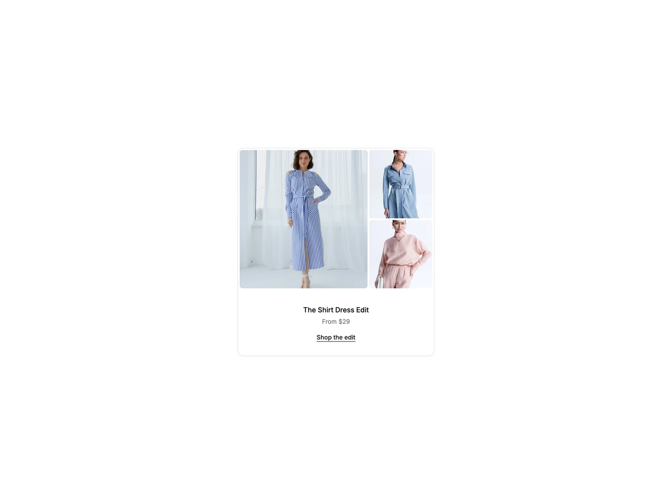
A bordered shadcn/ui card that links to a collection of shirt dresses. The top holds a photo grid with one large image on the left and two smaller images stacked on the right, all with rounded corners and a thin gap between them.
Hovering or focusing one of the small photos crossfades it into the large panel and frames the tile with a thin white outline. Moving away fades the large panel back to the lead photo. The fade is skipped when reduced motion is preferred.
Under the grid, a centered title, a short line with the starting price and an underlined Shop the edit link sit in a simple stack. The whole card is clickable, and the small photos and text link stay clickable above that overlay. The three images, title, price line and link are set in the data object.