

Product Card 17 block design & features
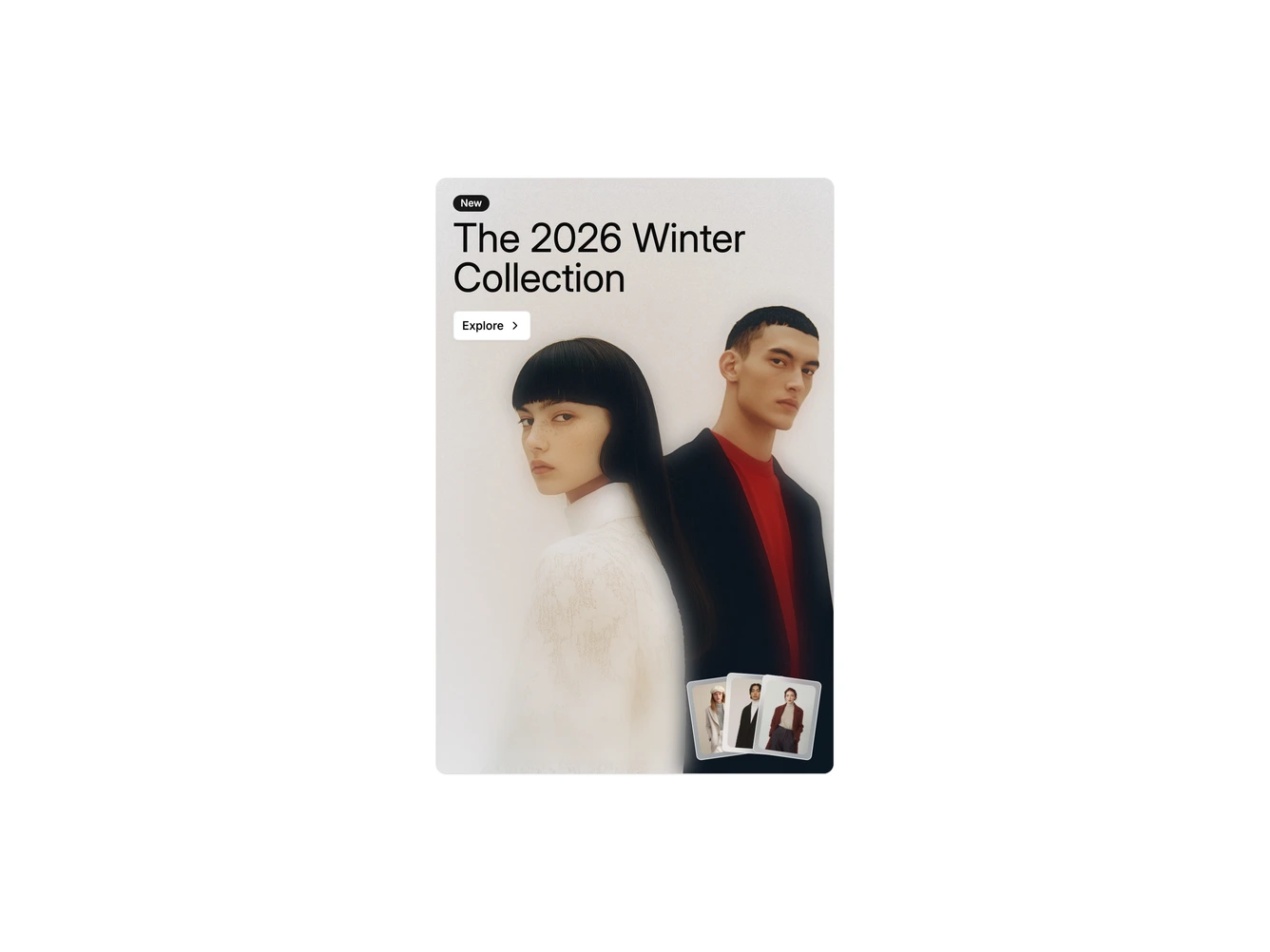
A tall shadcn/ui card that promotes a winter collection. A full-bleed fashion photo fills the card, softened at the bottom with a blurred fade. A New badge, a large heading and an outline Explore button sit in the top left corner.
In the bottom right corner three small product thumbnails are fanned out like cards. Hovering them shows a Best Sellers tooltip, and clicking opens a white panel over the bottom of the card with three products, each with a photo, name and price. A small close button collapses the panel, and on larger screens a bag button appears over each product photo on hover. The heading, background image, link and recommended products are set in the data object.
On mobile the card keeps its height and the panel still opens over the bottom, with the bag buttons always visible.