

Product Card 16 block design & features
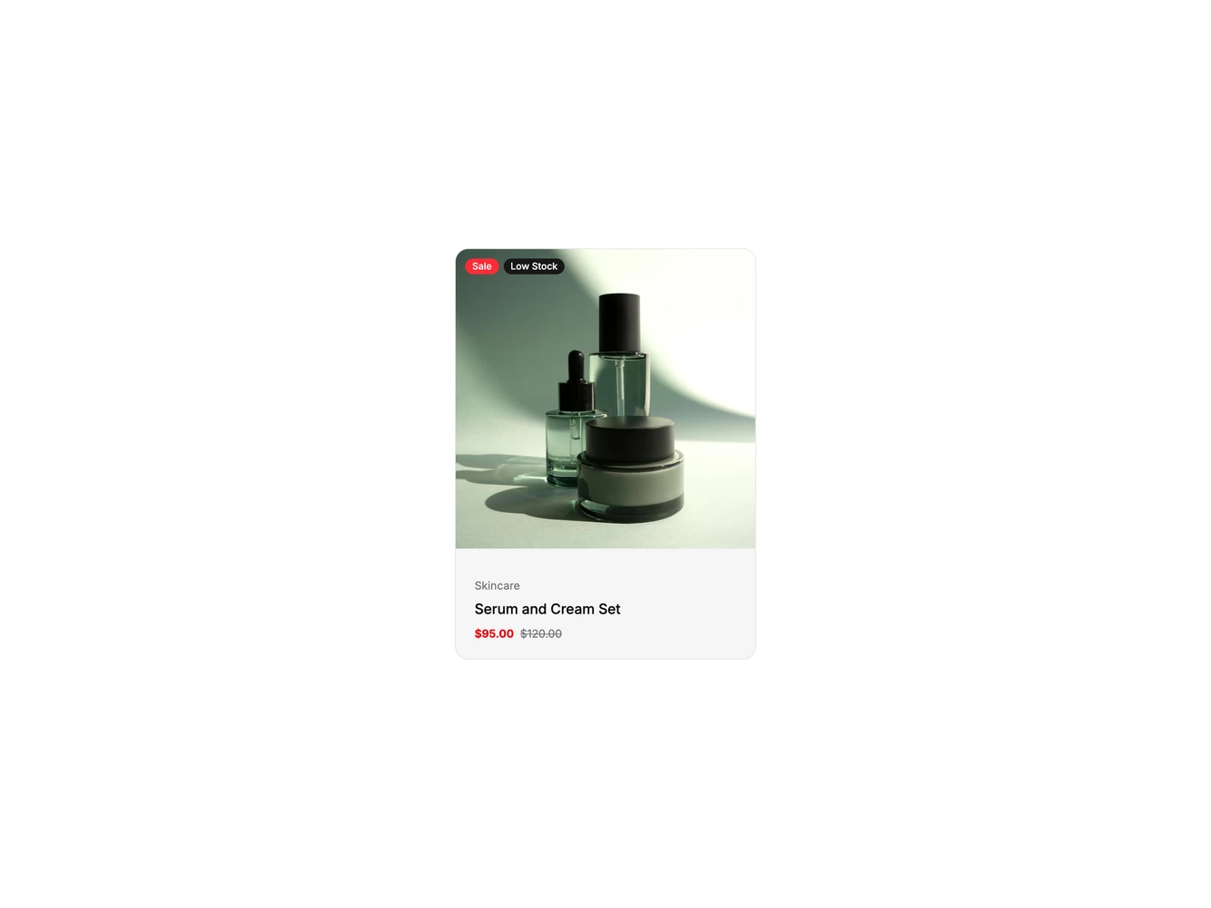
A rounded shadcn/ui product card for a serum and cream set. A square photo fills the top, with a red Sale badge and a dark Low Stock badge in the top left. The lower half is a muted panel with a small category label, the product name and the sale price in the destructive color next to the regular price.
Hovering the card slides a wide Quick View button up over the bottom of the photo and a round search icon button in from the right. Clicking Quick View unfolds a white panel over the bottom of the photo listing what the set includes, a short stock note and a full-width Add to bag button, with a small close button in its corner. The panel grows in height and fades in, the Quick View button reports its expanded state, and the motion is skipped when reduced motion is preferred.
The product name links to the product page with an underline on hover. Badges, contents, stock note, image and prices come from the product object. On mobile the hover buttons are hidden and a round bag icon button sits in the bottom corner of the photo instead.