

Product Card 14 block design & features
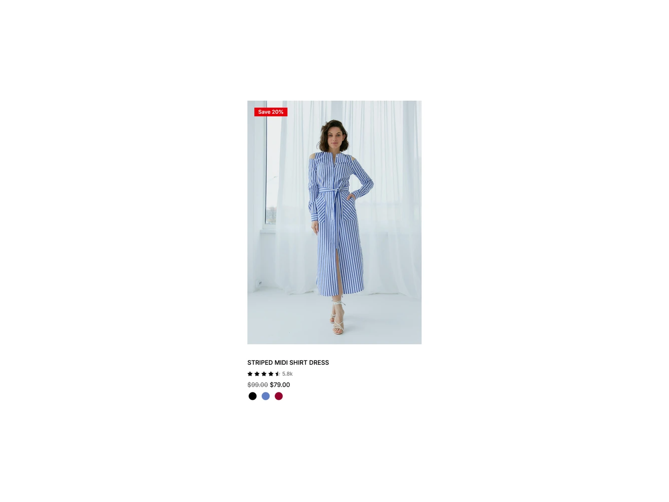
A tall shadcn/ui product card for a striped shirt dress. A square-cornered red badge reading Save 20% sits over the top left of the full-length model photo. Below are the uppercase product name, a small star rating with the review count, the struck-through regular price before the sale price, and a row of round color swatches that link to each color's page.
A round bag button fades in over the bottom right of the photo on hover. Clicking it fades in a rounded bar across the bottom of the photo with the sizes XS to XL, and the bag icon turns into a close icon. Picking a size swaps the row for an Added to bag message with the chosen size, and the bar closes on its own shortly after. The button reports its expanded state, and the sizes, badges, colors, rating and prices are configured in the product object.
On smaller screens the bag button is always visible, since there is no hover to reveal it.