

Product Card 13 block design & features
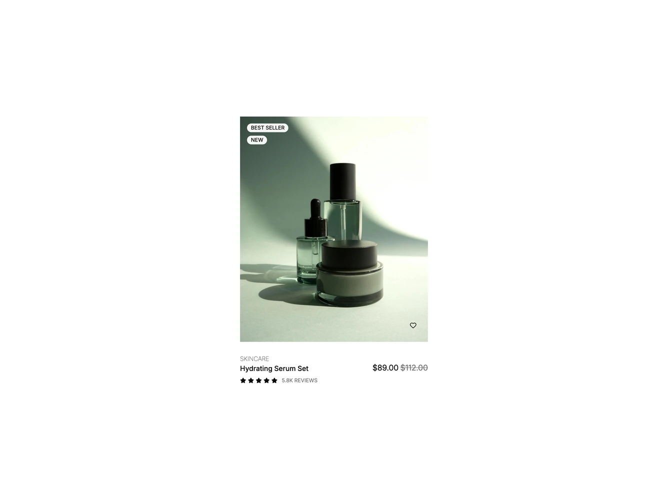
A borderless shadcn/ui product card for a serum set. Two small uppercase badges, Best Seller and New, stack in the top left corner of a portrait photo. Under the image are a category link, the product name with the price aligned to the right, and a five-star rating with the review count.
On hover the photo fades to a second shot, and a round bag icon button and a wide Quick View button slide up from the bottom edge beside a wishlist heart that is always shown. Clicking the heart saves the product: the button fills in and the heart turns solid red, and a second click removes it. The heart is a toggle with a pressed state and a label that changes with it. Badges, images, rating, review count and prices come from a single product object.
Below the large breakpoint the bag button stays visible next to the heart, so the card still offers quick actions without hover.