
Process 4 block design & features
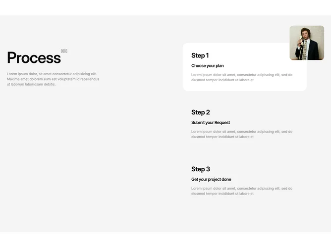
Process4 is a two-column process section using a six-column grid. The left two columns contain a sticky sidebar with a large heading, a superscript monospace step count, and a body paragraph. The right four columns list three step cards that respond to hover interaction. Each card is a rounded container showing a bold step number label, a title, and a truncated description. On hover, a floating image animates into view above the top-right corner of the active card using framer-motion fade and slide.
Non-active cards fade to a transparent background on large screens while the hovered card keeps its filled background. The floating image renders as a rounded-2xl object-cover thumbnail offset outside the card bounds. Titles use bold tracking-tight type and descriptions are limited to two lines via line-clamp. The monospace font for the superscript is loaded via a Google font hook.
The overall style is playful and interactive, rewarding hover exploration with visual reveals. Complexity is moderate because the block manages active-step state on hover and coordinates AnimatePresence for the image entrance and exit. You provide a three-item array with title, description, and image URL per step.
On smaller screens the columns stack vertically, the sidebar loses sticky positioning, and the image popup renders inline above the card rather than offset to the corner.