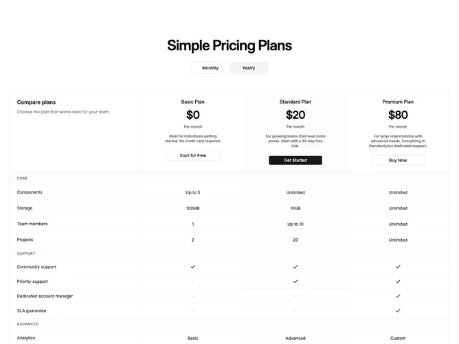
Pricing 46 block design & features
A centered heading and monthly/yearly toggle sit above a single large bordered table built with Shadcn UI components. The table header row contains plan summaries in each column: plan name, price, period note, short description, and a CTA button, all stacked vertically within the cell. The top-left cell holds a "Compare plans" label and helper text. Below the header, feature rows are grouped by category with full-width tinted section dividers. Each cell shows either a text value, a checkmark, or a dash icon.
The table lives inside a rounded container with a one-pixel theme border. Vertical column dividers separate each plan, including a left border on the first plan column to clearly delineate the feature-name column from the data columns. The highlighted plan column receives a subtle background tint on both its header and feature cells. Category rows span the full width with a muted background to visually break up long feature lists.
This is a dense, information-first layout that prioritizes comparison over visual storytelling. No separate cards or carousel; everything is one scrollable surface. The unified structure makes it easy to scan features horizontally across plans without context-switching between cards and a table. Moderate complexity: billing-cycle state toggles prices in the header row, and the feature data is a categorized array of rows.
On smaller viewports the table scrolls horizontally within its rounded container, maintaining the full column structure rather than stacking. A minimum width ensures columns stay readable at any screen size.