Pricing 45 block design & features
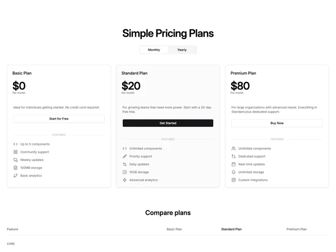
The section opens with a centered heading and a monthly/yearly toggle group built with Shadcn UI. Below the toggle, three plan cards sit in a row on large screens (carousel on mobile) showing plan name, price, period, description, CTA button, and a bulleted feature list separated by a labeled divider. Below the cards, an expanded comparison table groups features by category with plan-name column headers, text values, checkmarks, and dashes per row.
Each plan card has a one-pixel theme border, rounded corners, and an optional muted tint on the highlighted tier. The feature table uses category group headers as full-width dividers with uppercase labels. Column headers for the highlighted plan use foreground color while others stay muted. Rows alternate between text values and boolean indicators (check or dash icons). The table scrolls horizontally on smaller viewports with a minimum width constraint.
The combination of cards and table gives users two complementary ways to evaluate plans: a quick glance at pricing and highlights via the cards, then a detailed line-by-line comparison in the table below. This is a moderate-complexity block with billing-cycle state driving both the cards and the price display. Content is driven by the shared pricing-3-plans-monthly-yearly type plus an additional feature-table prop with category groupings.
On mobile the plan cards become a centered carousel with masked edges and navigation arrows. The table remains scrollable below, so the full comparison is always accessible regardless of viewport.