Pricing 1 block design & features
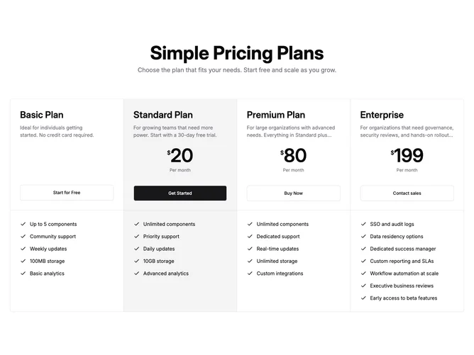
Pricing1 is a four-plan pricing table built with shadcn/ui, centered under a large heading and optional subheading. Plans render as equal columns inside one bordered container with vertical dividers on large screens. Each tier shows a plan name, a short description, a prominent monthly price when applicable, a full-width CTA button, then a separated lower zone with an optional comparison label and a checklist of features marked with check icons.
Highlighted tiers pick up a muted background and a solid primary button, while others stay on the default surface with outline buttons. Prices use oversized numerals with a smaller currency mark and period line beneath. Feature lists align left with consistent icon spacing, keeping scan comparisons easy across columns.
The look is classic SaaS tier comparison: structured, neutral, and comparison-first rather than decorative. Complexity is moderate because you supply four plan objects with names, prices, descriptions, button targets, and feature arrays. It is a common pattern executed cleanly with shadcn dividers and buttons.
Below the large breakpoint the four columns stack into a single scrollable column while retaining the shared outer border.