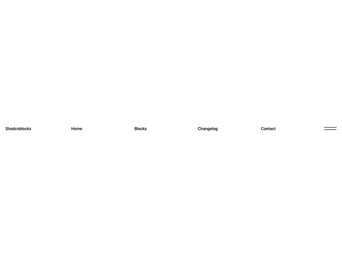

Navbar 29 block design & features
The top bar lays out a text logo, four inline navigation links (hidden on mobile), and a custom animated hamburger button in a single row with semibold tracking-tight text at large size. The hamburger uses two absolutely positioned bars that rotate into an X shape via framer-motion spring animations when toggled.
Activating the menu reveals a muted-background panel that wipes down from the top using a CSS clip-path inset animation over 350ms with an ease-out curve. Inside, the desktop view arranges four columns of six links each, with text set in a subdued 40% opacity foreground that brightens on hover. Each link shows a small ArrowUpRight icon that slides up from hidden on hover via a translate and opacity transition. A footer row at the bottom of the panel shows company contact info on the left and legal links on the right.
The typographic style leans editorial with tight tracking, semibold weight, and no icons in the main nav row. The mega menu's low-opacity default text and the clip-path wipe give the block a refined, portfolio-oriented character.
On mobile the four inline links disappear and the mega menu panel instead shows a single column of links at 2xl size. The footer row stacks vertically and centers its text. The hamburger toggle remains in the same position, keeping the interaction consistent across breakpoints.