Navbar 24 block design & features
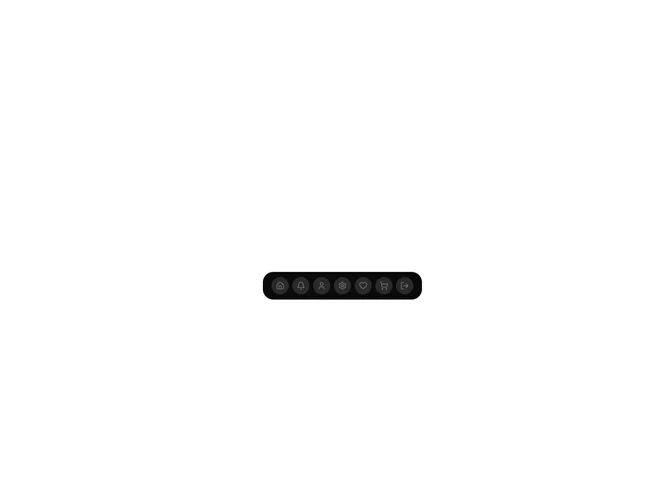
A floating dock bar is fixed to the bottom center of the viewport, rendered with a foreground-colored (dark) background and 3xl rounded corners at a 64px height. Seven Lucide icon tabs (Home, Bell, User, Settings, Heart, ShoppingCart, LogOut) sit inside, each on a semi-transparent background-at-10% container. Built with motion/react, the icons scale from 40px to 60px based on cursor proximity, using the same spring physics as the lighter dock variant but adding a dynamic border-radius transform that morphs each container from a 50px circle down to a 10px rounded square as the cursor nears it.
Hover reveals a tooltip label above the icon via AnimatePresence, matching the lighter dock block. The icon containers show muted foreground icons against the dark dock surface, and the overall contrast between the dark bar and the lighter page background gives this variant a bolder, more prominent presence.
The dark fill, rounded shape morphing, and semi-transparent icon backgrounds distinguish this dock from the muted-background version. The spring settings (mass 0.1, stiffness 150, damping 12) keep the scaling responsive and slightly bouncy.
On mobile the dock hides and a single toggle button fixed to the bottom-right corner expands into a vertical column of dark-background icon squares with staggered entrance animations, mirroring the lighter dock's mobile pattern but in the inverted color scheme.