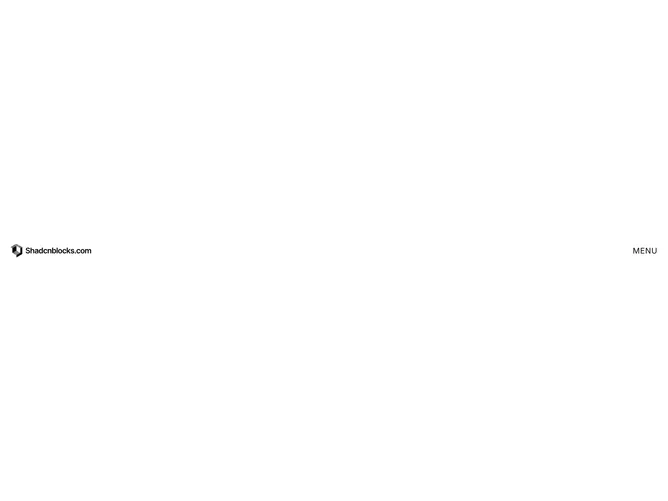
Navbar 21 block design & features
The bar shows a wordmark logo on the left and a text-based MENU/CLOSE toggle on the right, both at z-50 to stay above the overlay. The toggle swaps between the two labels with a framer-motion fade-and-slide animation. When opened, a full-screen fixed overlay fades in over the background color, centering the navigation content vertically and horizontally.
Menu items render as large uppercase text (4xl on mobile, 6xl on desktop) in black, heavy font weight, staggered into view with sequential delays. On hover each link blurs its text to 6px via a motion filter transition while simultaneously growing a primary-colored underline bar from zero to full width, creating a distinctive reveal-through-blur interaction. Social links appear below the main items in monospace small text with muted foreground color, sliding up with their own stagger timing. Hovering a social link nudges it 5px to the right.
The visual identity is bold and editorial, relying on oversized typography, generous vertical spacing between items, and the blur hover effect as its signature detail. There are no icons, dropdowns, or shadcn/ui primitives beyond the utility function; the component is pure layout and animation.
The overlay occupies the full viewport height, so no scrolling is needed on typical content sets. The toggle label change, the overlay fade, and the staggered item entrances all use ease-in-out curves at short durations to keep interactions snappy.