
Navbar 2 block design & features
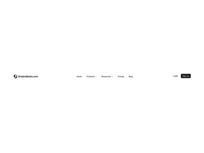
Navbar2 is a standard marketing header built with Shadcn UI, placing a responsive logo on the left, navigation triggers in the middle, and outline plus primary auth buttons on the right. Products and Resources expand into bordered dropdown panels with icon-led links and supporting copy, while Home, Pricing, and Blog stay as single links. The logo swaps between a full wordmark on desktop and a compact mark on mobile through dedicated logo image slots.
Visually it stays flat and neutral with a popover dropdown that slides and fades in from the trigger. Submenu icons use muted coloring that brightens on hover. Buttons are full size on desktop rather than compact variants. The mobile sheet mirrors desktop links inside accordion groups with the same auth stack at the bottom.
Functionally this matches Navbar1 but adds the shared logo component pattern for teams that want different assets per breakpoint. The animated dropdown viewport is a slightly more polished take on the simple icon menu pattern. Moderate complexity driven mainly by menu content rather than layout tricks.
On mobile the wordmark and icon logo both render inside the sheet header for brand continuity. Desktop navigation hides entirely below the large breakpoint.