
Navbar 12 block design & features
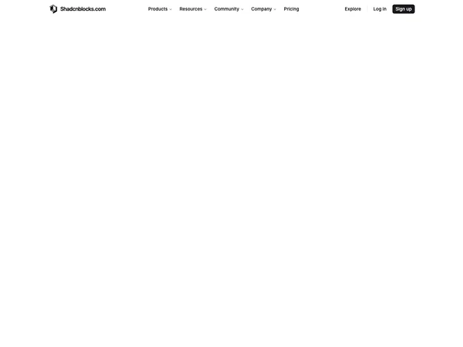
This fixed-position bar arranges a logo, shadcn/ui NavigationMenu triggers for Products, Resources, Community, and Company, plus Explore and Log in ghost buttons, a vertical separator, and a primary Sign up button across a compact 60px-tall strip. Dropdown menus for items with sub-links appear as small popover-style panels listing each link with an icon in a bordered square, a title, and a description line.
The Products dropdown is the richest, presenting ten items with icons and descriptions in a narrow list. The remaining dropdowns show plain text links without icons. All triggers and links use a reduced 15px font size with a short 30px pill height, giving the bar a dense but readable appearance.
Visually the bar sits on a solid background with a conditional bottom border that appears only when the mobile menu is closed. Text is medium weight, icon squares have a subtle shadow, and hover states swap the background to muted tones. The overall tone is utilitarian and compact.
On mobile the bar swaps to a full-viewport sheet with bold accordion headers that expand to show icon-and-label link rows. A primary and an outline button are pinned at the bottom of the sheet inside a bordered footer strip, and the first accordion section opens by default.