Logos 36 block design & features
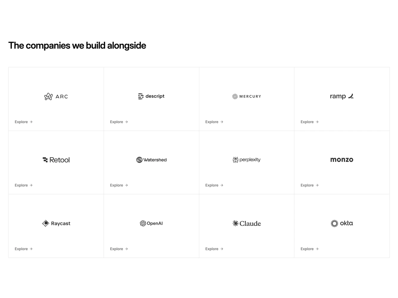
The block opens with a heading. Below it sits a ruled table of twelve customer logos, drawn with shared top, left, right and bottom borders so every line is a single crisp hairline.
Each cell is a full link. The logo sits optically centred with its own height tuned to the mark, so heavy wordmarks and light icon-plus-text marks carry the same visual weight. A small Explore label with an arrow anchors the bottom-left corner and darkens on hover while the cell picks up a muted wash.
The look is calm and editorial, closer to an index page than a trust badge strip. It works well when each customer has a case study worth opening.
On mobile the table reflows from four columns to three and then two, and the cells switch to a taller aspect ratio so the labels never crowd the logos.