
Logos 13 block design & features
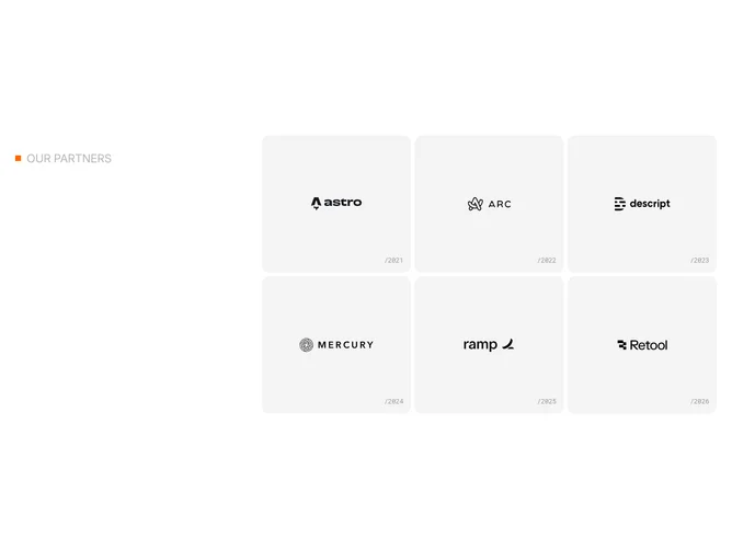
The layout splits into a two-column grid at large breakpoints. The left column holds a sticky label row consisting of a small orange square indicator and an uppercase "Our partners" heading in low-opacity foreground text. The right column contains a grid of tall, rounded cards on a muted background, each centering a logo image with a monospaced year string positioned in the bottom-right corner. Dark-mode inversion is applied to every logo.
Cards are generously tall with large rounded corners and no visible border, relying on the muted fill to define their shape against the page background. The year annotations use small mono text at reduced opacity, sitting as quiet metadata rather than primary content. Gaps between cards are tight, creating a tile mosaic effect.
The sticky label column, muted card surfaces, and monospaced annotations combine to produce a gallery-catalogue aesthetic. The orange square accent and faded uppercase text add a subtle editorial touch that distinguishes this layout from simpler logo grids.
On mobile the sticky column unsticks and appears above the card grid, which collapses from three columns to two while maintaining consistent card height and gap spacing.