Help 3 block design & features
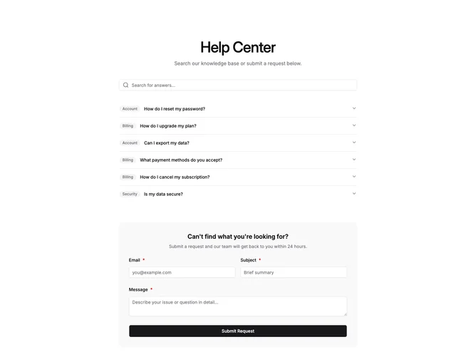
Help3 is a single-column help center section with three stacked areas: a search input at the top, an accordion FAQ in the middle, and a contact form at the bottom. The search input has a magnifying glass icon and filters FAQ items in real-time as the user types. Each accordion item shows an optional category badge before the question text. The contact form sits inside a muted container with email, subject, and message fields.
Light background throughout with no borders on the main container. The category badges use muted pill styling with small text. The search input has an inset icon. The accordion has clean divider lines between items. The form container has rounded corners and semi-transparent muted fill. Generous vertical spacing between the three sections.
Functional and understated with a standard help center layout. The search-first approach puts self-service ahead of submitting a ticket. Moderate complexity due to the interactive search filtering and accordion, but the visual design stays close to shadcn defaults. Requires FAQ content with questions, answers, and optional category labels.