Gallery 70 block design & features
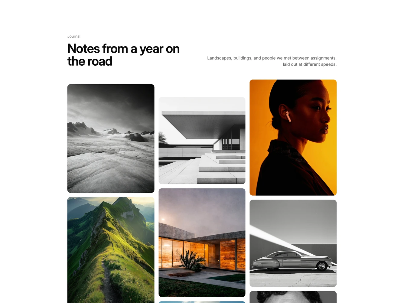
Gallery70 adds depth to a masonry layout. In this shadcn/ui block, a heading sits on the left and a short description on the right above three columns of photographs in square, 3:4, and 4:5 ratios. The middle column starts lower than the others.
As the page scrolls, the columns move at different speeds and each photo also shifts slightly inside its rounded frame, so the grid has layered depth rather than moving as one sheet. Hovering a photo slides a frosted caption up from the bottom.
It is quiet and editorial, a polished upgrade to a standard masonry grid for journals, travel, and photography portfolios. It needs about a dozen photographs of mixed ratios with short titles.
On mobile it drops to two columns and the third column of photos is hidden.