
Gallery 13 block design & features
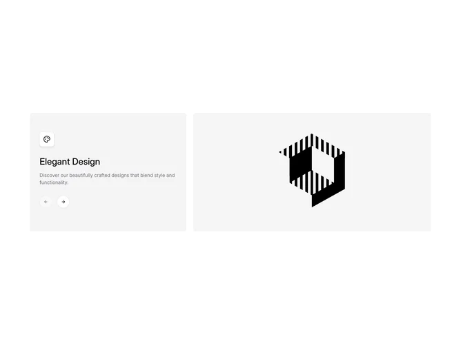
Gallery13 is a split slider built with shadcn/ui. The left column holds a small eyebrow, a counter, the current title and description, arrow buttons, and a row of thin segment lines. The right column shows a tall 4:5 photograph.
Moving to another slide crossfades the photo with a slight zoom while the text slides out and the new text slides in. Each segment line marks a slide and can be clicked to jump straight to it, and the active segment is darker than the rest.
It is calm and editorial, well suited to explaining a short series of ideas or principles alongside photography. It needs a portrait photo, title, and short paragraph per slide.
On mobile the photo sits above the text.