
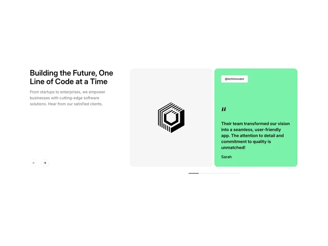
Gallery 10 block design & features
Gallery10 combines a carousel with category filters. In this shadcn/ui block, a heading sits beside previous and next arrows, a row of category chips sits below it, and a carousel of 4:5 photo cards fills the width. Each card carries a frosted caption with its title and category.
Choosing a chip slides the dark highlight across to it, resets the carousel to the start, and brings the matching cards in with a short staggered fade and lift. The arrows disable at the ends of the row, and each card zooms gently on hover.
It is practical and familiar, well suited to portfolios and catalogs with a few clear categories. It needs a photo, title, and category per item, and the categories are built from the items automatically.