

Feature 98 block design & features
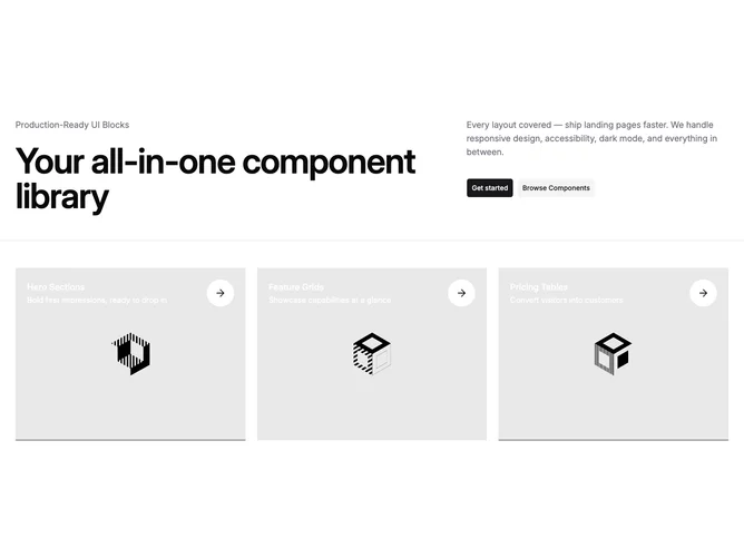
Feature98 is a split-header section built with Shadcn UI. The header uses a five-column grid where the left three columns hold a muted label and a large tracking-tight heading, while the right two columns contain a description paragraph and a pair of buttons. A full-width separator divides the header from a three-column grid of linked image cards below. Each card places a title, description, and a circular arrow-right icon over a full-bleed background image that scales up on hover.
Images render at a 4:3 aspect ratio with object-cover and a slight initial scale-up, expanding further on group hover with a half-second transition. The text overlay sits at the top of the card in background-contrasting color. Arrow icons live in circular containers using the background color for the fill and primary for the icon. The separator uses the default shadcn styling as a thin horizontal line.
The mood is editorial and image-heavy, letting large photography dominate while text stays concise and layered on top. The hover animation gives interactive feedback without being distracting. Complexity is moderate because you supply a label, heading, description, two button targets, and up to three feature objects with titles, descriptions, images, and links.
On mobile the image cards stack into a single column and the header grid collapses, placing heading and description in a linear vertical flow.