
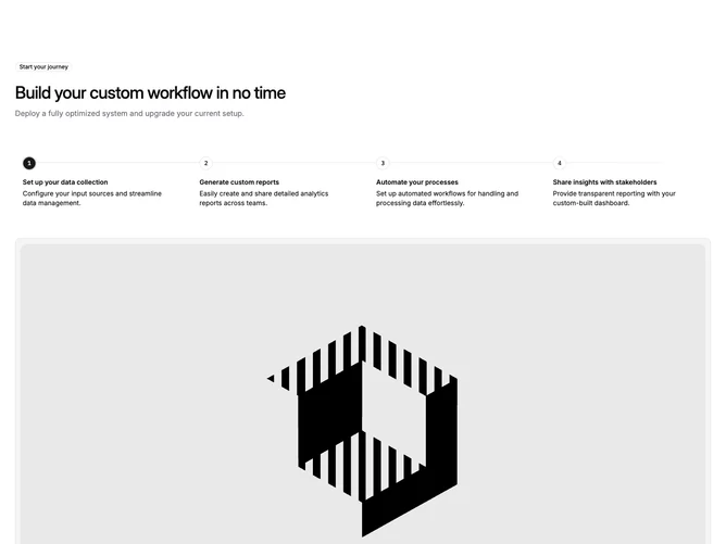

Feature 95 block design & features
Feature95 is a step-based tabbed section built with Shadcn UI. An outline badge, left-aligned heading, and short paragraph introduce the block. Below, the Tabs component renders a four-column tab list where each trigger shows a numbered circle, a bold title, and a description. A horizontal connecting line runs behind the step circles on large screens. The active tab displays its associated image in a large bordered panel beneath the triggers.
Step circles use a small rounded-full container with a mono font numeral inside. The active step fills its circle with the primary color, inverts the text to the background color, and adds a ring for emphasis. Tab triggers render card-like hover backgrounds on interaction. The image panel below sits on a muted background with rounded corners, a border, and inner padding framing the full-width image.
The look is guided and sequential, borrowing from wizard or onboarding patterns to walk the viewer through a multi-step process. The numbered circles and connecting line reinforce progression. Complexity is moderate because you supply four tab objects with titles, descriptions, and image paths.
On mobile the tabs abandon the horizontal trigger row and instead render each step vertically with a left-side connecting line. Each step shows its own inline image immediately below its description rather than using a shared content panel.