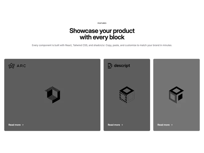

Feature 81 block design & features
Feature81 is a photography-forward grid built with Shadcn UI spacing and a set of linked image tiles. The header is centered: small uppercase label, large balanced title, and muted introductory paragraph. The grid below renders up to four full-bleed image links; each tile layers a semi-transparent dark scrim that deepens on hover, optional logo artwork near the top when provided, and a Read more row with a translating arrow pinned toward a corner depending on the tile index.
The aesthetic reads cinematic because imagery dominates and type stays white on the overlay. Rounded corners keep the gallery friendly rather than editorial. This block expects bold photos or stills; empty titles can work when logos carry recognition.
It is more elaborate than a plain card list thanks to varying aspect handling for specific tiles and mixed alignment of the footer text. You should plan consistent photography crops and decide whether every tile needs a mark.
Small screens use a two-column grid with selective spanning for the first tile; large screens expand to four columns for a mosaic-like strip. Hover relies on opacity and background tint shifts rather than scale effects, keeping motion subtle.