Feature 64 block design & features
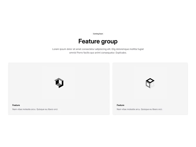
This section is built with shadcn/ui: a small outline badge, a large section title, and a centered paragraph sit above a two-panel row. On wide viewports the row uses a seven-column grid so the first panel reads wider and the second narrower; both panels stack an image area above a small feature label and muted supporting line. The overall structure is a teaser-style announcement rather than a dense feature matrix.
Light page background with bordered cards that use the accent surface. Images sit in aspect blocks with generous padding inside each card. Typography is headline-forward at the top, then smaller semibold labels over body-sized muted text in the cards. No motion beyond default link and hover behavior from the surrounding layout.
This is a moderate-complexity marketing pattern focused on an asymmetric pair of visuals. The seven-column split is the main twist compared with a simple fifty-fifty row. Content-wise you need one badge label, a section title, intro copy, two images, and two short feature blurbs. The block stays easy to wire to real launch content.
On small screens the grid collapses to a single column so the wide card leads and the narrow card follows, keeping the same vertical rhythm.