
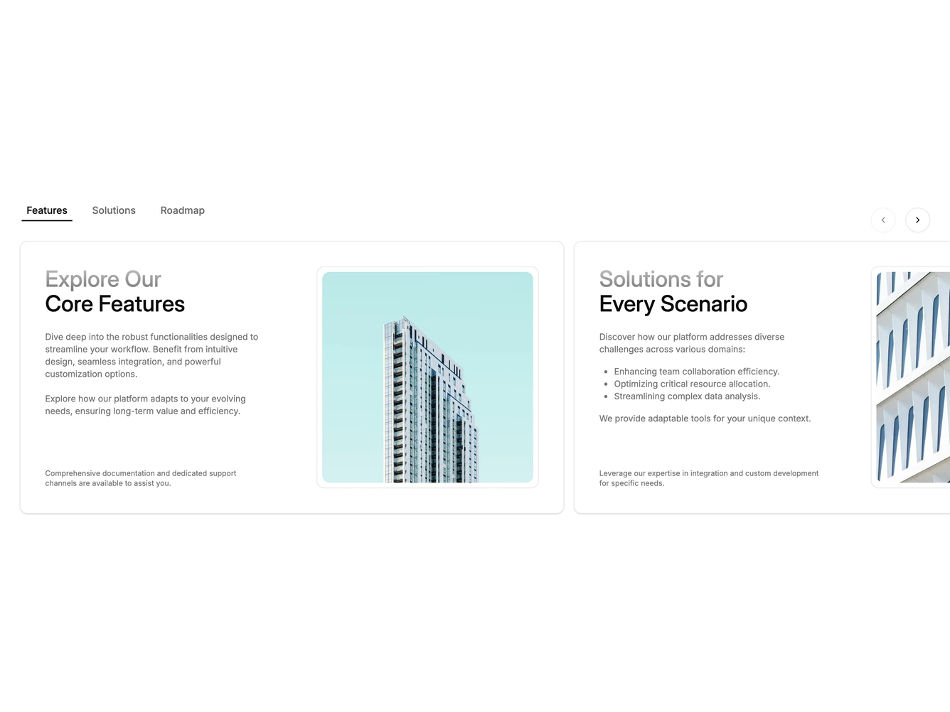
Feature 393 block design & features
The block pairs a shadcn/ui Tabs row with a Carousel so that selecting a tab scrolls to the matching slide and swiping a slide updates the active tab. Each tab trigger sits inside a transparent TabsList with a sliding underline indicator whose width and position animate with a 700ms ease-out transition. CarouselPrevious and CarouselNext buttons appear to the right of the tabs on wider screens.
Each slide is a bordered, rounded-xl card split into a two-column grid. The left half contains a heading with a gradient-to-muted-foreground span for secondary text, a description block that can include paragraphs and lists, and a small muted note at the bottom. The right half holds a bordered image panel with inner padding and rounded corners. The visible carousel overflow allows the next card to peek in from the right.
Stylistically the component feels structured and documentation-like, using soft borders, a subtle card shadow, and gradient text to add visual hierarchy without heavy decoration. The tab-carousel synchronization keeps interaction tight and predictable.