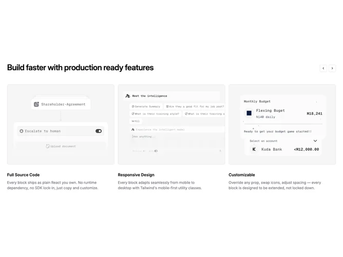
Feature 381 block design & features
This block keeps Feature380's shadcn/ui surface pattern with the same image-led card anatomy under a section headline, but carries six features end-to-end from the shared placeholder pack instead of three.
The layout never collapses to a grid. Every viewport uses the Carousel primitive with start alignment so paging advances predictable columns of cards. Narrow widths show one slide per step, tablet breakpoints widen each slide to half width so two cards stay visible, and large screens step three cards across before arrows reveal the remaining entries.
Moderate complexity driven mostly by content volume. Expect six distinct titles, descriptions, and assets like Feature380; the carousel loops when more than one slide exists.
Prev and next controls sit on the same row as the headline on the right edge as outline buttons with modest rounding, matching Feature380's chrome rather than overlay arrows.