Feature 380 block design & features
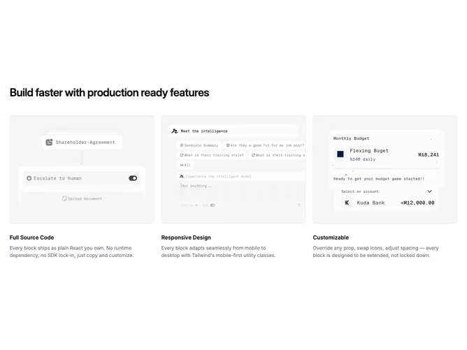
This section mirrors Feature39 on large screens with a headline followed by three image-led columns built with shadcn/ui. Each column repeats the same card anatomy as Feature39 (rounded bordered photo, bold title, muted paragraph).
Below large breakpoints the columns disappear into a horizontal carousel built from the shared Carousel primitives. Phones page through single full-width cards flush to the track edges while tablet widths from md upward render two equal cards side by side without cropping, with carousel controls aligned to the right of the section headline.
Moderate complexity: identical props expectations as adjacent feature-card-list blocks (three images, titles, descriptions). The main stylistic twist is responsive swapping between one-at-a-time paging on phones and two-across stepping on tablet before dense desktop rows replace the carousel entirely.
On sub-desktop widths the prev and next outline buttons share a row with the headline on the right. From large breakpoints upward only the headline and grid remain visible.