Feature 379 block design & features
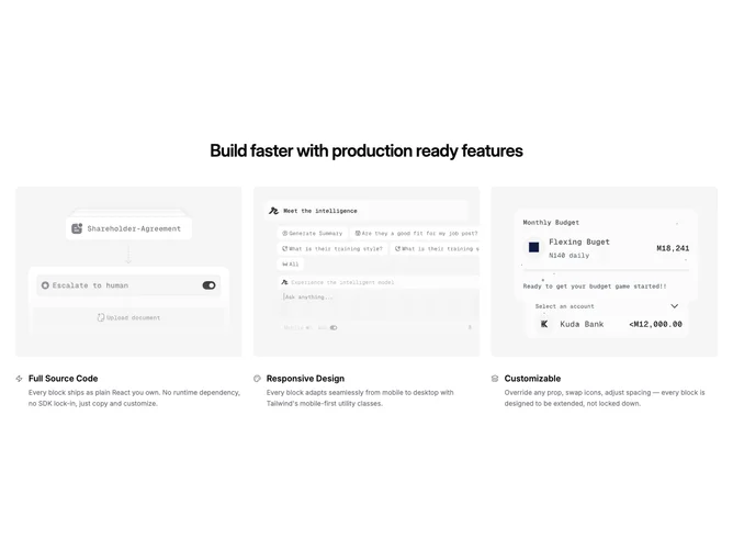
This Shadcn UI feature section uses a centered heading followed by a three-column grid of cards. Each card pairs a large image with an icon positioned to the left of the title, giving the feature list a compact, scannable layout.
The block relies on theme tokens throughout and keeps visual weight on the images, which sit above a tight icon-title-description cluster. Spacing is generous between cards but condensed within each card's text region. Rounded corners on images soften the grid, while smaller icons sit flush beside titles without extra chrome.
A straightforward, content-driven pattern that works well when each feature has a distinct visual and a short explanation. The inline icon placement distinguishes it from card layouts where icons float above or below the title. Moderate complexity with minimal content requirements — three images, titles, and descriptions.