Shadcn UI Feature Block
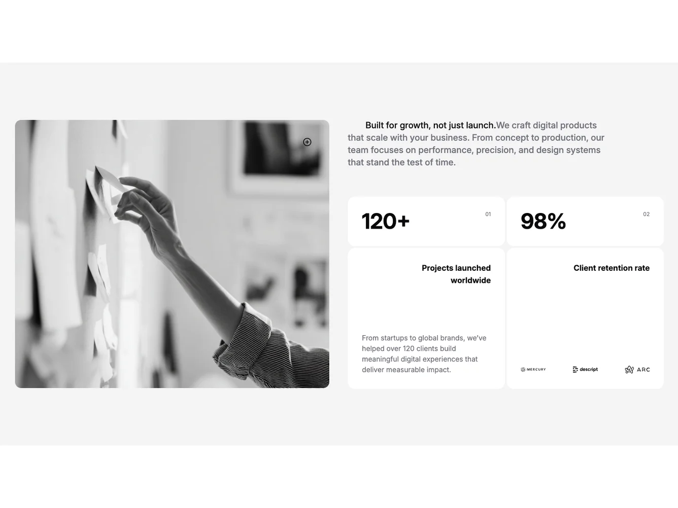
The section opens on a two-column layout at medium breakpoints: a left image in a rounded, bordered frame with a small icon overlay, and a right column with a single indented paragraph that mixes a bold lead with muted supporting copy. Under that, a bento grid shows four related cells: the top row pairs two large numbers with index marks, the bottom left expands a stat with a long description, and the bottom right shows a second stat label with a row of small logos, built with shadcn/ui style surfaces on a muted page background. There is no eyebrow, section label, or main heading above the split; the layout is container-width only.
Styling is consistent with a portfolio impact block: soft muted fill behind white or background-colored cards, large numerals, hairline order labels, and restrained typography. The image uses a wide aspect in the frame, and the stat area uses a tight two-column grid on desktop with a single-column stack on small screens.
The block is a slimmer version of a full-bleed impact feature: it reads as a facts strip that can sit under another hero or heading elsewhere on the page. Complexity is similar to a multi-stat bento, with a moderate set of text and image props and two structured stats. It fits React or Next.js apps that already use the shadcn blocks layout patterns.
The component is intended for custom copy, one hero image, and two stat objects with values, labels, and optional per-stat body text or partner logos, without duplicating a separate title row in the same section.