
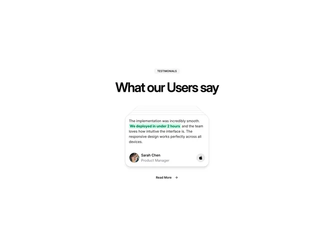

Feature 281 block design & features
Feature281 is a testimonial-first block built with Shadcn UI, centered on a pill label and oversized heading before a stacked deck of quoted stories. Each story shows an avatar portrait, name, job title, a short paragraph, and a brand glyph for extra context, with occasional phrases picked out in a green highlight treatment that reads inline.
The stack rotates or reorders cards with smooth motion while the rest of the chrome stays minimal, so attention stays on quoted language. Ghost-styled secondary navigation under the stack gives a low-contrast follow-up link with a sliding arrow cue. Spacing is generous vertically, which suits landing-page pacing more than dense dashboards.
Overall the mood is confident and product-launch oriented, leaning on recognizable company marks and portrait photography for credibility. This is a moderately complex social proof pattern because of animation timing and per-card assets, not because the layout itself is intricate. Expect multiple complete quotes plus headshots and logo choices.
The layout remains single-column at all breakpoints, so readability depends on line length controls in the heading and card width rather than reflowing columns.