Feature 266 block design & features
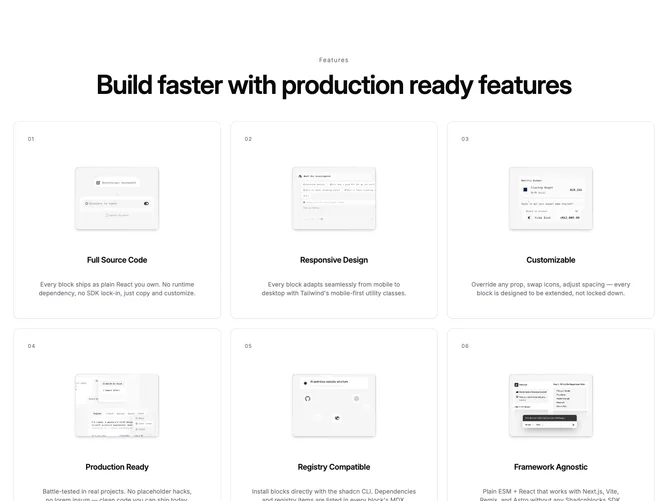
Feature266 is a feature grid built with shadcn/ui cards and tooltips. A centered kicker and large heading sit above a one-, two-, or three-column grid. Each cell is a numbered card with a framed photo, title, and short supporting line; hovering the image opens a tooltip with the same asset at a larger size. The section uses Framer Motion so the header eases in and the cards appear in a staggered sequence.
Muted borders, translucent card fills with a light backdrop blur, and wide letterspacing on the kicker give a quiet editorial feel. Thumbnails sit in rounded rectangles with a soft gradient wash behind the image. Card titles shift to the primary color on hover while body copy lightens toward the default foreground. Motion is limited to entrance and hover color shifts; there is no looping animation on the media itself.
Overall this reads as a refined marketing gallery: structured, photography-forward, and a bit more interactive than a static grid because of the tooltip zoom. Complexity is moderate. You need a consistent set of images and parallel short labels for each item so the grid does not feel uneven.
On small screens the stack is a single column with full-width cards; from medium breakpoints upward the grid adds columns and the tooltip still provides the enlarged preview without leaving the page.