Feature 261 block design & features
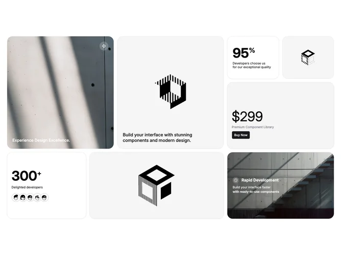
Feature261 is a bento grid built with Shadcn UI that stitches together uneven tiles: large imagery, numeric stats, pricing lines, small text promos, and avatar stacks. The section reads as a single “why us” mosaic instead of repeating one card template end to end.
Varied tile sizes create a magazine layout with alternating photo depth, bold numerals, and lighter typographic blocks. Corners stay rounded consistently so the collage still feels like one component family. Density runs higher than a simple three-card row, but spacing keeps each tile legible.
Highly compositional: you are juggling photography, metrics, and social proof at once, so weak assets show quickly. Best when each tile answers a different objection (speed, price, community) without duplicating messaging. The look is modern product marketing, not a sparse starter kit.
On small screens the mosaic reflows into a vertical story; large hero tiles usually take full width first so imagery and headline remain visible before scroll.