
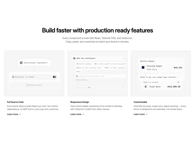

Feature 23 block design & features
Feature23 starts with a centered intro block built from Shadcn UI text and an optional outline badge above the headline. A short description sits under the title when provided. Below, three feature entries display in one column on small screens and expand to three columns on large breakpoints. Each entry wraps a cropped photo inside a muted padded frame with rounded corners, then shifts to title, muted body copy, and a simple inline link styled as Learn more with a trailing chevron.
Visual tone is airy and modular: ample vertical section padding, balanced heading width, and restrained borders that separate imagery from surrounding surface. Imagery defaults to landscape aspect with top-weighted cropping so faces or UI remain visible.
This is a straightforward card list pattern with modest decoration and clear symmetry across three entries. Content needs include a headline, optional badge string, optional lead sentence, and three feature objects with imagery, titles, blurbs, and destinations for the links.
The grid collapses gracefully so each card reads as a vertical story before the layout widens again.