Feature 216 block design & features
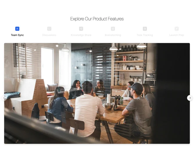
Feature216 anchors the page section with a light headline, then uses shadcn/ui Tabs framing a wide photo that swaps per tab alongside a centered summary line. Across very wide breakpoints a full rail of vertically stacked triggers shows icon tiles with tinted backgrounds and monochrome treatment that drops away for the active item; compact widths hide that rail for a condensed label row above the artwork instead.
The photography sits inside a rounded bordered frame with a stronger drop shadow while inactive triggers read gray and softened until hovered or picked. Circular secondary controls perch just beyond the margins, vertically centered against the hero image midpoint, advancing or rewinding tabs in order until the ends stop movement.
Compared with a minimalist text tab strip, this block leans showy thanks to tinted icon chips and carousel-like arrows. Moderate sophistication: curated photos, succinct captions, short tab naming, plus controls that stall when you reach either end.
Extra-wide layouts expose every trigger at once; narrower layouts rely on the compact label pairing and swipe-friendly arrow stepping so the storyline still advances without cramming six labels across.