Feature 19 block design & features
The block opens with Shadcn UI typography centered in a narrow column: a large title and muted supporting paragraph set expectations. Below, a horizontally scrollable Tabs list shows many short tab labels; choosing a label swaps the detailed pane without leaving the section.
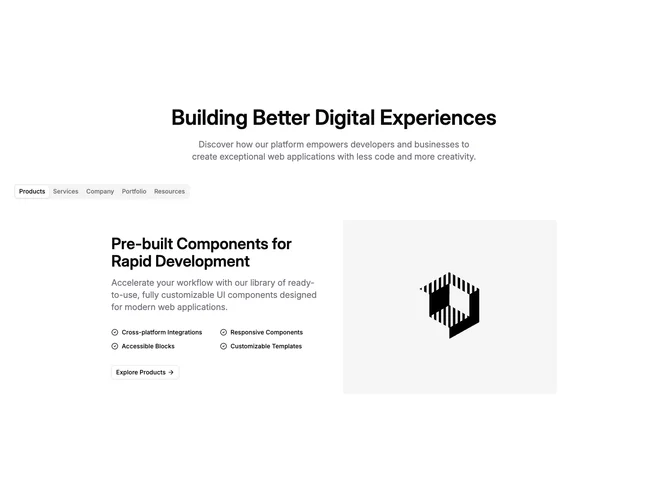
Each pane is a marketing slide on a two-column grid. One side stacks a bold H2-sized title, long description, a checklist rendered as two columns of items with circular check icons on large screens, and a small outline button linking forward with trailing arrow. The other side shows a tall rounded raster image with object-cover. On small screens the image moves above the text via order utilities.
Styling stays within common shadcn defaults: muted text, medium font weights, rounded media, and restrained button sizing. The pattern is familiar for SaaS marketing pages that need one interactive navigator covering several stories.
Content work is non-trivial: every tab needs title, long description, bullet strings, link target, and image URL, so the block rewards structured CMS data.