
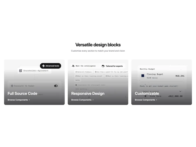

Feature 117 block design & features
Feature117 is a three-column image feature row built with Shadcn UI avatars on select overlays and Lucide accents. The section begins with a centered display heading and optional muted description. Each column is a link wrapping a photo, with a translucent bottom gradient, a small decorative chip area that can show a filled pill, avatar chip, or zap label, and lower-stack title text plus a chevron-linked prompt. Layout uses extra-large breakpoints to align three even columns with consistent aspect-ratio imagery.
Styling leans on photography contrast with animated gradient reveals on hover, pill badges using primary fills, and white or near-white text on the overlays. Avatar chips add a frosted treatment with backdrop blur for separation from the photo. Type scales up on large screens so titles feel poster-like while staying compact on small viewports.
This pattern is a focused, photography-forward trio often used to funnel visitors into categories or collections. It is more expressive than an icon grid and depends on strong horizontal imagery plus concise overlay copy. The first party data lives in the shared feature-card-list style props, so hooking different photos and titles is straightforward.
On narrow screens the columns stack with the same overlay structure, keeping tap targets full width for each card-shaped row.