Feature 110 block design & features
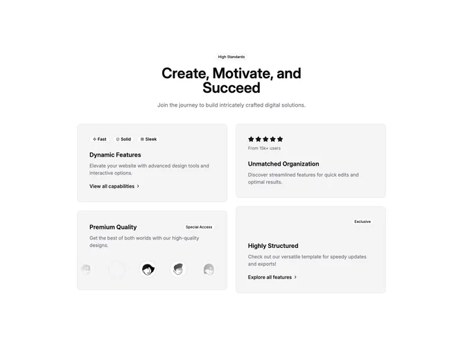
Feature110 opens with a narrow centered column containing an outline badge, a bold heading, and muted introductory copy, then expands into a two-column bento-style grid built with shadcn/ui. The left stack begins with a muted card carrying three small outline badges (each pairs an icon with a word such as Fast or Solid), a subheading, paragraph, and chevron text link. Under that, another muted card titles Premium Quality, adds explanatory copy, and embeds a carousel of circular avatars ringed with hairline borders; auto-scroll runs horizontally with gradient masks along the sides.
The right column mirrors the card language: one tile highlights a five-star row with caption text beneath, followed by another card that top-aligns an Exclusive badge with heading, paragraph, and link. Surfaces stay flat with borders and muted fills rather than heavy shadow stacks.
Overall tone is product-marketing collage: multiple proof points in one glance. Elaborate relative to a single-column feature because of the carousel dependency and repeated badge vocabulary; still entirely component-driven without hero illustration.
At medium width the grid locks to two columns; spacing tightens padding inside cards but preserves readable line lengths.