

Feature 105 block design & features
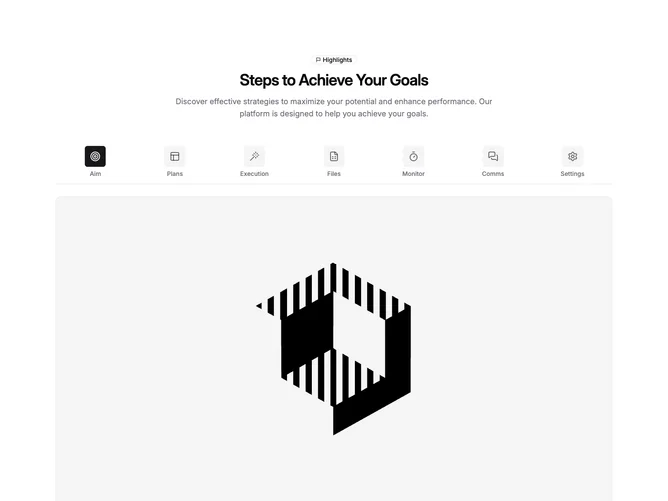
Feature105 is a centered feature section built with shadcn/ui. The top stacks an outline badge with a small flag icon and the word Highlights, a balanced headline, and a muted supporting paragraph. Below that, a line-variant tab strip lists seven steps (labels such as Aim, Plans, Execution, and Files), each trigger showing a rounded square icon tile and short label. Choosing a tab swaps the panel content to a single full-width image inside an aspect-video frame with rounded corners and a light border.
Light theme styling relies on muted fills for inactive icon backgrounds and a primary fill on the active tab icon. The tab row sits in a horizontal scroll container so the full set of triggers stays reachable on narrow viewports. Typography is headline-forward up top with smaller muted labels under each icon. Apart from tab state colors, motion is minimal.
This reads as a structured workflow or checklist pattern rather than a dense product tour. The emphasis is icon-led scanning plus one large visual per step, so it suits staged narratives where each slide is mostly pictorial. Complexity is moderate: you supply tab labels, icons, and imagery per step.
On small screens the icon rail scrolls sideways while the image panel stacks beneath it at full content width.