
Faq 21 block design & features
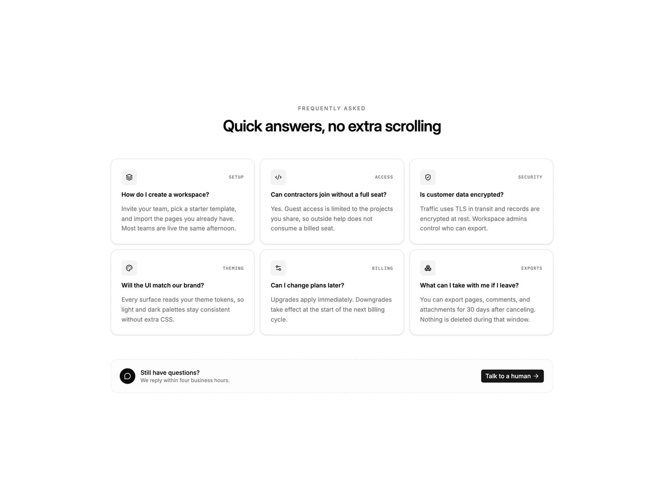
Faq21 is a centered FAQ built with shadcn/ui, opening with an uppercase label and a headline, then a responsive card grid of questions. Each card pairs a small icon tile with a mono topic label, a short question, and an always-visible answer. A dashed support row sits under the grid with a circular message icon, two lines of help copy, and a button that links out.
Cards sit on the card surface with a hairline border and a light shadow. Icons rest on a faint foreground wash. The support row uses a dashed outline and a muted fill so it reads as a follow-up, not another question card. Spacing stays open, with a three-column grid on large screens that drops to two and then one.
The block reads as a compact, catalog-style FAQ rather than a collapsing accordion. Showing every answer at once is a less common choice and suits short replies. Complexity is moderate and content-driven: you need six concise Q&A pairs plus topic labels and icons that match those topics.
On smaller screens the cards stack into two columns, then a single column, while the support row becomes a vertical stack with the button under the copy.