Ecommerce Hero 1 block design & features
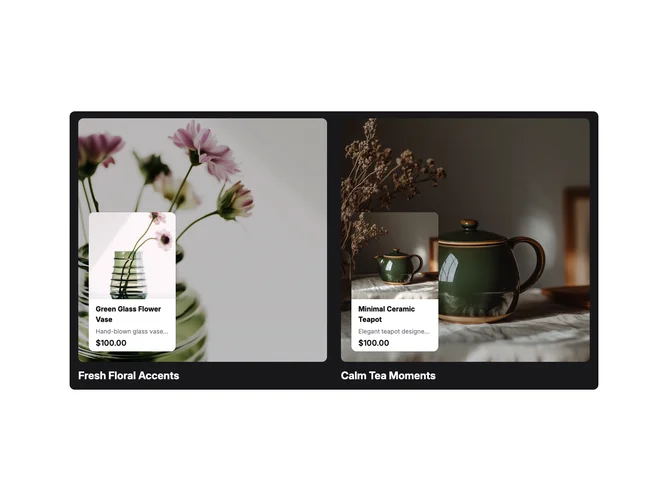
EcommerceHero1 is a full-width header built with shadcn/ui, wrapping an autoplay carousel inside a rounded container on a solid primary background. Each slide shows two columns side by side: each column has a tall image area with a dimmed overlay, a product card anchored toward the bottom corner, and a bold section title below the image. The carousel loops with a long delay between slides so each pair of products reads as a curated set.
The primary shell reads as a branded band with strong contrast on the titles. Product cards use a horizontal layout on small screens and stack image above copy on larger breakpoints, with price lines using the shared Price component. Images are cropped to rectangular hero proportions. The motion is autoplay only with no visible arrows in the default setup.
Moderate complexity: the layout repeats a clear pattern twice per slide rather than mixing many block types. It is image and catalog driven, and you need paired hero photos, short section titles, and product names, descriptions, and prices for each card. A straightforward choice when you want a catalog-style showcase with a colored frame rather than a full-bleed photographic hero.
On small viewports the two columns stack vertically while keeping the same card and title structure.