Download 26 block design & features
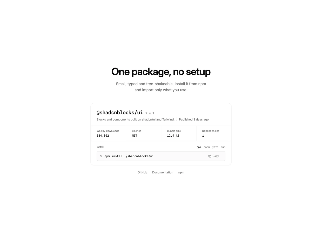
Built around a single card that reads like a package page. The package name is set in monospace with its version beside it, followed by a short summary and when it was last published.
A row of stats shows weekly downloads, licence, bundle size and dependency count, divided by thin rules.
Below, an install line offers npm, pnpm, yarn and bun as plain text toggles. The copy button writes the current command to the clipboard, shows Copied with a check and announces the copy to screen readers.
Plain text links to GitHub, the docs and npm sit under the card. On mobile the stats drop to a two by two grid and the command scrolls inside its box.