Data Table 9 block design & features
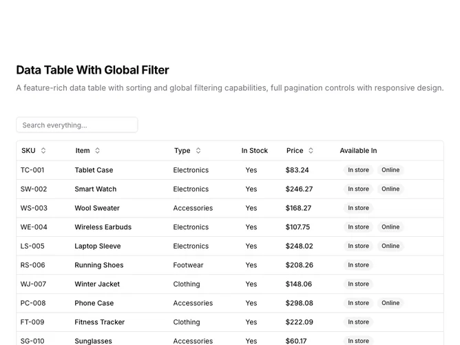
DataTable9 is a left-aligned section with a heading, description, a toolbar with a global search input, and a full-width data table with pagination controls below. The toolbar contains a text input that searches across all columns simultaneously. The table displays six columns: SKU, item name, type, stock status, price, and availability badges. Sortable column headers include toggle buttons with directional arrows. The table contains fifteen rows of product inventory data. Full pagination controls appear below.
Light background with dark text. The table has a thin rounded border. The search input sits above the table with "Search everything..." placeholder text. Column headers use ghost-style buttons that show sort direction icons on interaction. Price values are formatted as currency. Availability displays as secondary badges. The pagination area includes row count, page size dropdown, page indicator, and navigation buttons. Compact row height with consistent cell padding. Static layout with no entrance animations.
This is a globally-filtered data table with shadcn-default styling. Unlike single-column filtering, the global search matches text across all visible columns, making it easier to find records when users do not know which field contains their search term. A practical choice for general-purpose data exploration.