Data Table 8 block design & features
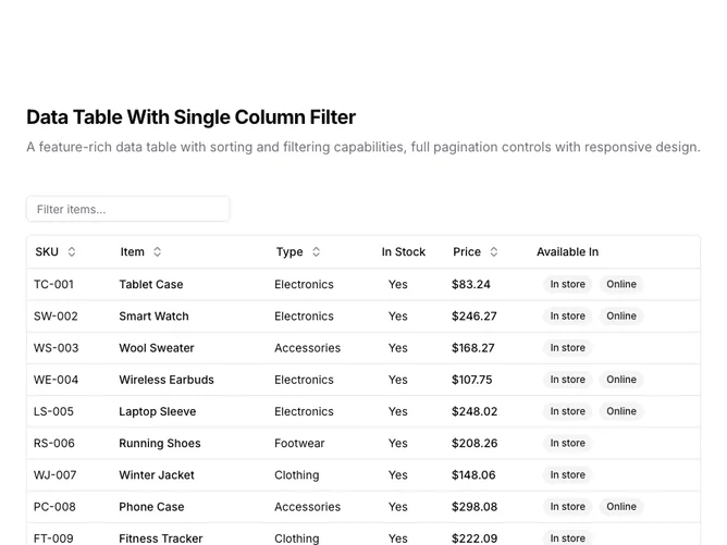
DataTable8 is a left-aligned section with a heading, description, a toolbar with a filter input, and a full-width data table with pagination controls below. The toolbar contains a text input that filters the item column as users type. The table displays six columns: SKU, item name, type, stock status, price, and availability badges. Sortable column headers include toggle buttons with directional arrows. The table contains fifteen rows of product inventory data. Full pagination controls appear below including rows-per-page selector and page navigation.
Light background with dark text. The table has a thin rounded border. The filter input sits above the table with placeholder text. Column headers use ghost-style buttons that show sort direction icons on interaction. Price values are formatted as currency. Availability displays as secondary badges. The pagination area includes row count, page size dropdown, page indicator, and navigation buttons. Compact row height with consistent cell padding. Static layout with no entrance animations.
This is a filtered data table with shadcn-default styling. The single-column filter provides quick text search on one specific field. Combined with sorting and pagination, it covers common data exploration needs without the complexity of multi-column or faceted filters.