Data Table 7 block design & features
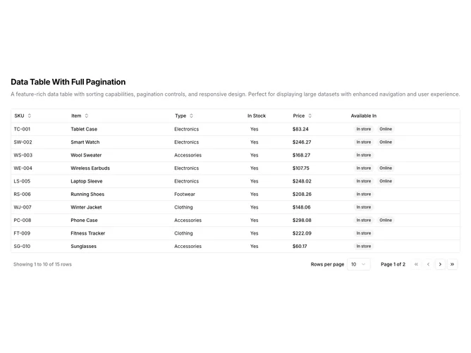
DataTable7 is a left-aligned section with a heading, description, and a full-width data table with comprehensive pagination controls below. The table displays six columns: SKU, item name, type, stock status, price, and availability badges. Sortable column headers include toggle buttons with directional arrows. The table contains fifteen rows of product inventory data. The pagination footer includes row range display, a rows-per-page dropdown selector, page number indicator, and navigation buttons for first, previous, next, and last pages.
Light background with dark text. The table has a thin rounded border. Column headers use ghost-style buttons that show sort direction icons on interaction. Price values are formatted as currency. Availability displays as secondary badges. The pagination area is more elaborate than basic tables, featuring a select dropdown for page size options and icon buttons for jumping to first/last pages. Compact row height with consistent cell padding. Static layout with no entrance animations.
This is a full-featured paginated data table with shadcn-default styling. The pagination controls offer complete navigation including page size selection and direct jumps to first/last pages. Suitable for datasets where users need flexible control over how much data they view at once.