Data Table 6 block design & features
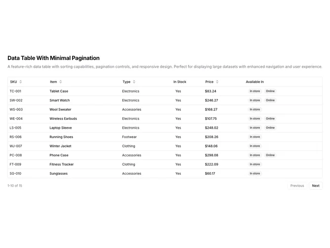
DataTable6 is a left-aligned section with a heading, description, and a full-width data table with pagination controls below. The table displays six columns: SKU, item name, type, stock status, price, and availability badges. Sortable column headers include toggle buttons with directional arrows. The table contains fifteen rows of product inventory data, paginated to show ten at a time. The pagination footer shows row range and total count with previous/next buttons.
Light background with dark text. The table has a thin rounded border. Column headers use ghost-style buttons that show sort direction icons on interaction. Price values are formatted as currency. Availability displays as secondary badges. The pagination area shows "1-10 of 15" style text with outlined previous/next buttons. Compact row height with consistent cell padding. Static layout with no entrance animations.
This is a basic paginated data table with shadcn-default styling. The pagination controls are minimal with just previous/next navigation and a row count indicator. A straightforward implementation for datasets that need simple page-by-page browsing.