Data Table 5 block design & features
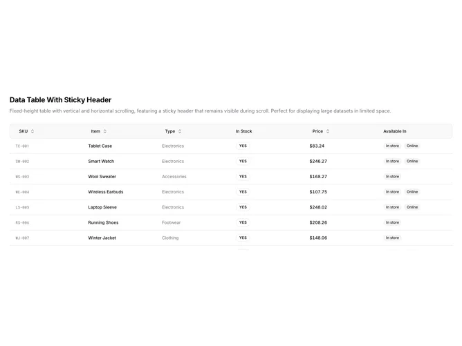
DataTable5 is a left-aligned section with a heading, description, and a fixed-height data table with both vertical and horizontal scrolling. The table displays six columns: SKU, item name, type, stock status, price, and availability badges. Sortable column headers include toggle buttons with directional arrows. The table contains ten rows of product inventory data. The header row stays pinned at the top while scrolling through rows. A mobile swipe hint appears below on small screens.
Light background with dark text. The table has a constrained height that triggers vertical scrolling when content overflows. The header row has a tinted background and remains sticky during scroll. SKU values use monospace uppercase styling. Stock status displays as pill-shaped badges with borders. Price values use tabular numerals. Availability shows as secondary badges. Compact row height with responsive padding. Static layout with no entrance animations.
This is a data table optimized for large datasets in limited vertical space. The sticky header ensures column labels remain visible while scrolling through many rows. Combined with horizontal scroll support, it handles both tall and wide datasets. The styling is functional and close to shadcn defaults.