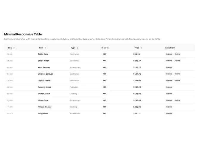
Data Table 4 block design & features
DataTable4 is a left-aligned section with a heading, description, and a full-width data table wrapped in a horizontal scroll area. The table displays six columns: SKU, item name, type, stock status, price, and availability badges. Sortable column headers include toggle buttons with directional arrows. The table contains ten rows of product inventory data. A mobile swipe hint appears below the table on small screens.
Light background with dark text. The table sits inside a scroll container with visible scrollbar. The header row has a tinted background with rounded corners on the first and last cells. SKU values use monospace uppercase styling. Stock status displays as pill-shaped badges with borders. Price values use tabular numerals for alignment. Availability shows as secondary badges. Compact row height with responsive padding that adjusts on mobile. Static layout with no entrance animations.
This is a mobile-optimized data table with a shadcn-default appearance. The horizontal scroll wrapper and swipe hint text make it practical for viewing wide tables on narrow screens. Custom cell styling adds visual variety compared to a plain table, but the overall look remains functional and understated.