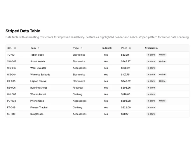
Data Table 3 block design & features
DataTable3 is a left-aligned section with a heading, description, and a full-width data table below. The table displays six columns: SKU, item name, type, stock status, price, and availability badges. Sortable column headers include toggle buttons with directional arrows. The table contains ten rows of product inventory data.
Light background with dark text. The table has a thin rounded border with a tinted header row. Every other row has a subtle muted background, creating a zebra-stripe pattern. Column headers use ghost-style buttons that show sort direction icons on interaction. Price values are formatted as currency. Availability displays as secondary badges, sometimes two per row. Compact row height with consistent cell padding. Static layout with no entrance animations.
This is a basic, functional data table with a shadcn-default appearance. The alternating row colors make it easier to track data across wide tables, a classic pattern for improving scanability. A straightforward implementation that prioritizes readability over visual flair.